September Community Update

Good morning (or afternoon or evening depending on your part of the world!)

The September Community Update is out. You can read it below or in it’s original format
https://puzzlequest3.com/september-community-update/

==============

SEPTEMBER COMMUNITY UPDATE

Summer has changed into Autumn and welcomes in September’s community update!

Shifting Timing

We started this community blog as a chance for our player community to see a small part of what we’re working on here at Infinity Plus Two! We want to focus on what we’re actively working on behind the scenes and how we’re making changes based on your feedback. We’re shifting our blog releases to mid-month to avoid colliding with Patch Notes releases.

ROADMAP – September 2022


Please note that this roadmap is a work-in-progress and things may change or shift!

It’s a Two-Parter!

Yup! It’s a big one this time around!

We planned for some pretty big changes in 1.4 (Relics and Shards Updates, Follower Updates (part 1) and Adventure). Since these were all quite chunky features, we’re bringing you the Relics and Shards Changes and the (highly anticipated) Follower Updates with 1.4 on October 19th at 5pm PST [October 20th at 1AM UTC] and we’ll be introducing you to our brand new game mode “Adventure” just a few weeks later in mid-November!

We’ll tell you a little more about Adventure next blog as we come closer to its release…

For now, let’s take a quick look at some of the features coming to you in 1.4!

First up, Relics and Shards Changes.

You folks have been telling us that it can be pretty difficult to get some of the stuff you need or that you get too much of the stuff you don’t. We totally agree!


For a start, the Relics are getting a little name change so you know exactly which ones belong to which set without needing an encyclopedic knowledge of where you found things. We’re also smoothing Relics and Shards out in a much more fundamental way too which should make it much simpler and easier to upgrade what you need without carrying around a whole dragon’s horde of stuff in your wallet!

Next, Follower Updates (part 1).

Yes. Finally! We’re tweaking our first group of Followers:

  • Toragon
  • Gemka
  • Soulchaser
  • Darkhunter

We mentioned that we wanted to break the Follower Updates down into chunks (and BOY are we glad we did after we did the design and construction for this fellas). This first chunk is trying to address a problem that a lot of the Followers have – “Why am I upgrading?”

For some, this is easy. Others are a little less flashy. So we’re adding some sparkle, pizzazz and (bringing us to the second part of these Follower Updates) some features you folks have been asking for for a while…

What’s that? In the distance… Do we hear… Re-Rolls…?

Toragon, Gemka, and Soulchaser are getting new features that allow you to:

  • Choose the slot type
  • Choose the set
  • Re-roll attributes
  • Re-roll element
  • At higher levels choose the element

Darkhunter will allow you to choose whether he crafts a Rune or a Scroll and at higher levels you can choose the element!

And while October 19th is just around the corner, here’s a sneak peek at one of the Skeletal surprises coming in Spooktober

Changes and Feedback

This month we read a lot of your feedback (and we do mean a lot) !

From the inventory UI, follower updates, inventory space, and difficulty with upgrading, we’ve read it and have started making some changes.

We were able to roll out a couple of Quality of Life items pretty quickly this month:

  • Increasing vault space
  • Removing the Possessed buff from Resh – While this was a cute idea on its own in single-player battles, it negatively impacted Tourney, where scoring is partially based on Life Lost

And, of course, there are still more changes to come. So here are some upcoming changes we will be rolling out after considering some of your feedback:

Inventory UI

  • Adjusting borders on gear to help distinguish rarity between items
  • A detailed Vault View options that can show:
    • Amount of gear armor or resistance
    • Gear Set icon indicator to on gear pieces
    • A name display option on items

Here’s a peek at what we’re working on!

Please note this is an early look and may not represent the final changes.

That’s it for the September Update, see you in mid October!

6 Likes

I think this is definitely one of the best changes (albeit without the full details) that could come to this game, period. The inability to tailor mastery of gear or to find epic level runes just to get mid-level gear upgrades has really killed new player interest in the game. I get that finding the resources necessary to upgrade your gear to mythic is going to be a huge grind. Having to farm for days or even a week or more to find the right color resources needed to evolve your ring to level 26 is just ridiculous.

I’m very happy to see this change and looking forward to seeing how it is fully implemented.

8 Likes

Sibellos is right on the money with this observation. I’ve stayed quiet for awhile and have silently observed the state of the game.

I’ve watched the frustration vented in general chat by many players.

I’ve watched multiple players join the the guild I am in, become frustrated because it is too hard to build a basic gear set and participate in the daily kingdom defense, and then quit the game in frustration.

These changes are so badly needed for the long-term health of the game. Also looking forward to these needed changes (even if they cost Gems for a re-roll)).

4 Likes

YAY! But please fix kingdom defense. Also more more more and also more inventory. Kingdoms should be collaborative, not intra-competitive. Inventory at max should fit at least one of every item in every color. I have all these wonderful heroes I never use because I can’t spare the space to get them properly geared. That just can’t be the vision. It just can’t.

5 Likes

Rerolls!
All looks good to me :slightly_smiling_face:

So is the inventory rework going to be more than just adding a token amount of extra space as more gear is released? Or is something more significant planned?
I can’t see anything noted on the roadmap

2 Likes

pretty sure they are referring here to the paltry inventory increase we received already. I could be wrong. But my reading counts this as patting their backs for that massively inadequate bump.

3 Likes

I agree that the update reflects the past increase to space

So I am curious if there is going to be a rework OR just these incremental increases that dont seem to be sufficient
Roadmap is silent on the issue

3 Likes

We definitely need more inventory space. As has already been mentioned, I effectively run one hero because there’s just not the space the collect the gear needed to run more at high levels, never mind pvp. Don’t even get me started on how impossible it is to be truly competitive in pvp if you’re not a whale. :cry:

1 Like

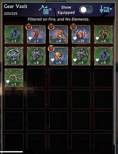
I have a great illustration of just how inadequate the inventory space is. This is every bit of gear I had a few weeks ago:


You can see just how little gear I have in each category, yet I’m at the limit. I certainly don’t have enough room for one of each set, or sets for all my heroes. Even without considering element.

2 Likes

As for the update itself:

  • The timing shift is nice. It’ll mean information about the game at two different times in a month, so more to look forward to.

  • I’m glad Adventure is being shifted back slightly so they could fix some things. I was hoping that this is what they’d do. The current content needs to be improved before new content is added, so this is a good sign.

  • So 3 weeks away. So long to wait! But I know the devs need the time.

  • Okay, you have to give them credit for that image, haha. It captures the situation so well. Admittedly, weapons shards are probably the worst ones they could have chosen (I find weapon shards to be rather rare compared to the other ones) and minion shards would have been the best choice (as those are very common and the most useless), but that’s nitpicking. Great meme.

  • Ooh, relic and shard changes, interesting. I like the part about the names. And it does sound like they’re keeping element for them unfortunately (getting rid of element for them was one of my big but unlikely hopes) but also that potentially they might be willing to make some moderate sized changes instead of just smaller ones. Holding my breath hoping the changes are good ones, and ones that are as extensive as seems to be hinted!

  • Whoo!!! Follower Updates, finally!!! The things mentioned sound very promising. Just hoping now that the cost isn’t so exorbitant that we can actually use them freely.

  • Being able to choose for DH sounds promising as well. Though I’m concerned by the fact that we get DH so late, so if those features are locked to higher levels, then they might come too late to be useful. I’m at level 50 and have been finished the main story for a few weeks now, and still only have DH at uncommon. Players need Epic runes of certain colors well before they can level up DH a lot. No way to get Glyphs with DH either it looks like, unfortunately, which makes the changes to him useless to older players (one player in my guild who has been playing for a very long time mentioned that this was the case).

  • No mention of changes to ore/crafting costs, or follower crystals, which might be a sign that those stay the same. It would be disappointing if so. But maybe that’s something they’ll change at the end?

  • New design isn’t particularly exciting to me: too generic, and has been done too many times before. The inclusion of a War Horse is interesting though. Is this supposed to be a skin for one of the existing classes? Hard to see where a War Horse could fit into one of them, which intrigues me a bit.

  • …It took you a week to merely add a few inventory slots. I don’t think that’s something you should be congratulating yourselves on. You were admittedly pretty quick with the Resh problem though. At the time, I was impressed you were able to make an important decision and carry it out so quickly.

  • Good to hear about the inventory change. That looks much better overall. However, the way the level and gear score just float in the middle of the image over the picture is a bit strange. What about something like this instead (apologies for my Photoshop skills):
    PQ3_1.4_gear_preview-revamped
    Here, I moved the gear set icon to the top right where the upgrade arrow is. I moved the level to the top middle, with the upgrade arrow next to it. The level and arrow are centered. When there’s no upgrade available, the arrow goes away, and the level alone is centered. I moved the gear score to the bottom middle. With these changes, everything is visible and nicely laid out. Though I do admittedly still dislike how the image is the focus this way, not the text…
    Edit: Though I just now realized that the images lack the item name. That’s important info, so please include it as well!

  • While you’re fixing the vault, please make the icons a bigger too, as that’s another major issue with it.

  • Edit2: You know, actually, after thinking about it, I think something similar to the Equipment rectangles from 1.2 (just with the part where it says the equipment slot swapped for the name of the piece and the set icon in the upper right corner instead) would work best:


    With them, the image and the text share space equally, giving attention to both. The rectangles are a good size: small enough to fit a bunch on a screen, but large enough to be read easily. And they have enough room for all of the relevant info to fit nicely in them.

  • Also, as happy as I am to hear about the vault fixes (which is quite happy), just fixing the vault view to be more detailed is again, only bandaiding the problem. We’ll still be left with something that’s worse that what we had before. These changes are a good start to fixing the gear menu, but we’re not going to be left with something functional after them. We’ll still be left with things like the hero taking up all of the left side of the screen, tiny equip icons, tapping/clicking doing different things each time (which is terrible design principle, as it breaks the rule of consistency), THE UPGRADING TO MAX THING WHICH YOU’VE BEEN PROMISING FOR MONTHS TO FIX, EVEN BEFORE THIS UPDATE, the gear button on the left side of the screen, causing us to have to reach across the screen to access it, not being able to view all of our gear at once, weird sorting, etc. I understand that it takes time to get things done, but the long list of things that need fixing that aren’t mentioned here makes me worried.

  • Also, no word of any fixes to the other terrible changes that 1.3 made such as cramming everything onto one battle screen, the rearrangement of the bottom nav, and so on. I’m only hanging on and continuing to play the game because of hope of things being fixed in 1.4. But if it doesn’t, and we get no promises about things being fixed, then I just don’t have it in me to continually struggle with the UI anymore. I play way less now because of it.

  • (Also, please at minimum move the gear button back to the right side of the screen. That’s a simple enough fix, and it’s one of the things that’s annoying me the most right now.)

2 Likes

One other thing: You’re making an optional detailed Vault View instead of just changing things to be more details. More options are good, but it sounds like you don’t really believe that more details and text and less plain icons with no description are things the majority of your players want. It sounds like you believe there’s still a large section of players who will find the textless icons useful, which is… concerning. I don’t know how much of your player base has to actively complain over and over to convince you there’s nothing redeeming about the 1.3 update. We don’t want you to keep bits and pieces of it, thinking they were good changes…

2 Likes

The update is sounding great, nervous about the implementation but hopeful :smiley: Just doing a few followers was a good move.

Couple of things to mention:

  1. Yeah, still want more gearspace.

  2. Inventory.

First the borders look great and will help lots distinguishing spell rarities.

No mention of not automatically upgrading to max :frowning: Can this be an option in the settings? That way people who don’t want it can actively turn it off.

*Given all items have the same armor or resistance at a given level I personally don’t find the numbers important to show on the inventory as I go by the level numbers, but it’s not a problem to show them.
*Gear set items. I guess the idea is to help know what the gear pieces are? But we still have to LEARN which icon belongs to which gearset.
*Name display. Great! Until I looked at the sneak peak pictures again and realised these are still the teeny tiny icons you introduced in 1.3. The only way I can see this work is to cover the whole picture with the gear name. I hope I’m wrong as this feels like a band-aid on a badly infected wound.

I really feel the inventory would be so much more useable if the Gear Vault was 2 or 3 icons wide, showing the names always and with a decent size level number (possibly the icons being a little higher too). The old gear rectangles that showed what was equipped would be perfect with the slot swapped for the item name and a few graphical tweaks.

I currently still find my self not using the inventory because of the small nameless icons if I can help it and I just can’t get used to it. Not to mention there has not been a single positive or neutral comment about this specific change on here or on discord. If I want to look up gear information I use my computer web browser and look at gear attributes etc. I just salvage almost everything straight out of the crates instead of deciding if it is something I may want to keep to create a build for another hero at a later date. Anyway…

One last point.


Assuming you’re going to keep the small icons despite the feedback I was thinking that the text is smaller so I compared it to the current size text by taking a screenshot on my phone and blowing it up to your picture here. The new text is much smaller and I doubt I will be able to read it on my phone without squinting and bringing the phone to my face. The current level numbers are already on the border of being uncomfortable to read.

2 Likes

Can you please give us some sort of option to sort inventroy by set?? A clear division or space between different set gear would make things so much easier to visually and mentally decipher

also this

2 Likes

Without an easier way, you can use the search function using the set name

1 Like

We’re shifting our blog releases to mid-month to avoid colliding with Patch Notes releases.

That’s it for the September Update, see you in mid October!

So, uh, it reached mid October, and nothing yet. Are we getting a blog release this month?

2 Likes

Hey!

Due to the extra public holidays, we have had this month, the October Blog will be slightly delayed!

We had also intended on releasing the patch notes for 1.4 early this month, but like the Community Blog this was also unfortunately delayed.

Looking to release 1.4.5 and 1.5 patch notes prior to the update going forward :sparkles:

2 Likes

Ah, makes sense. Awesome, and thanks for the reply!

:frowning::frowning::frowning::frowning::frowning::frowning::frowning::frowning::frowning::frowning::frowning::frowning::frowning::frowning::frowning::frowning::frowning::frowning:

3 Likes

22 minutes late and counting. :joy:

Honestly not surprised it’s not out yet, but if the devs are going to put a specific time for a release, rather than just a date, it’d be nice to actually get it out on time. It would be nice to see some feedback from folks letting us know why it’s late though, and when we should really be expecting it.

2 Likes

Keep spamming F5 every minute and waiting. Hope I can see something interesting.